Building Mobile Responsive Apps with Intent-Driven Design

At Appsmith, we have a monthly Demo Day to give our engineers an opportunity to show off the cool projects they’re working on. This is something that we all look forward to, as it gives teams that don’t normally work with each other on a day-to-day basis a chance to see what others are doing and give each other feedback. At one of our recent Demo Days, we had presentations from our teams that are focusing on the developer experience (DX) of building applications on Appsmith.
One such feature that I showcased was intent-driven auto-layout for the Appsmith studio’s canvas. There has been an interesting conversation around the topic among the engineers who worked on this feature, and we think it will also be interesting to you, our users and members of the Appsmith community. So we’re sharing the details about our team’s decision process for why and how this feature would be implemented, and how it contributes to our DX.
Helping Appsmith users build mobile-friendly apps (and getting a productivity boost as a bonus)
Intent-driven auto-layout is the first step on the path to our larger goal of intent-driven design across the entire Appsmith platform. Our goal with intent-driven design is to minimize redundant work by understanding and executing user intent rather than forcing users to manually do the work that can be offloaded to a computer. This first step focuses specifically on the canvas that holds the widgets for your application.
 When building an application in Appsmith, you can drag and drop different widgets, like inputs, buttons, and tables, onto the canvas to create your user interface.
In previous versions of Appsmith, you had to define the exact position and dimension of each widget by dragging and nudging each widget on the canvas. It required a lot of tinkering (for example, calculating column widths to horizontally split content) and the apps built this way did not adapt well to the large variety of screen sizes out there.
With the new intent-driven auto-layout feature, however, you can drop widgets “close enough” to where you want them, and Appsmith handles the exact placement internally. Every time you move or delete certain widgets, your application’s entire user interface (UI) is also automatically rebuilt, so there are no holes and no need to micro-adjust alignment.
Problems with the old layout system
First, creating even a simple interface was too slow. Users had to spend a lot of time babysitting their UI by constantly moving and resizing widgets. Spending too much time nudging widgets around on the canvas means that you have less time to spend thinking through and developing your application!
The second problem was that it was too clunky to create UIs for different devices. Most layouts that looked good on desktops often did not look good on mobile (and vice versa). Developers often ended up maintaining two copies of their apps (desktop and mobile) because it was nearly impossible to create a single layout usable across the whole range of devices.
The crux of both of these problems was absolute positioning: the widgets ended up exactly where the developer placed them on the canvas with no corrective algorithm whatsoever. This concept is easy to get started with, but doesn’t scale well beyond very simple apps, especially if you want them to remain usable on both desktop and mobile.
And that was the catch: absolute positioning may be intuitive, but it doesn’t scale well. On the other hand, auto-layouts (which the entire modern web is built around) are completely unintuitive for people unfamiliar with UI-building. So instead of just switching directly to auto-layouts, we tried to combine the intuitiveness of drag and drop absolute positioning with the power of auto-layouts.
Why we chose intent-driven auto-layout
Internal apps often have rather simple UIs, so instead of trying to create a do-it-all-and-make-me-a-coffee app studio, we focused on speeding up the ability to create generic interfaces — even by people without much knowledge about interfaces and front-end development.
As long as UIs remain simple, it’s possible to automate a large portion of the work of creating them through software. You don’t have to know anything about configuring and nesting CSS flexbox containers to move buttons around or place two inputs near one another. You also don’t have to worry about adjusting content to different screen sizes when using a mobile device.
We wanted to lean into this potential by working towards the “build once, run everywhere” future, where developers focus entirely on their core application logic without worrying about the UI. To do this, we followed proven user experience (UX) patterns, but instead of trying to stick to the old paradigm at all costs, we started building the foundation of the future where anyone can rapidly build a UI that works fine on any device.
Preventing users from breaking their apps without limiting their creativity
We experimented a lot while building this feature and had to continually discard some of our hypotheses. One example of this is our early idea to let users adjust a container’s positioning properties . This was proven to be worthless during usability sessions as users did not, in fact, understand the logic of auto-layout positioning. This was the first time that we realized adding more features and giving more options might not be the right answer.
After a few iterations we ended up doing the complete opposite: taking away all the “nice to haves” and focusing only on the essentials. So instead of providing users with more freedom (to create a mess) we started building a system of constraints that discourages the use of unfriendly UX patterns.
For example, we don’t even allow you to scatter buttons randomly across the canvas or squash inputs so much that they aren’t usable. Simple rules like these enable our users to create responsive interfaces that don’t break across different screen sizes without limiting what they can do in any detrimental way.
And even if you do make a bunch of changes to your UI with auto-layouts that you eventually decide against, you can always easily roll back your changes through Appsmith’s native integration with Git.
How it works behind the scenes
Auto-layout stacks have a single dimension, while most UIs are two-dimensional. In order to add the second dimension, we created a cascade of invisible nested blocks, both vertical and horizontal.
The issue here is that these require unnecessary babysitting for seemingly simple actions like placing two widgets side by side or keeping both Save and Save as Draft buttons to the right while keeping the Discard button on the left. So instead of forcing app builders to do this thankless work of adding/configuring/deleting these wrapper blocks, we have offloaded this work to the software so that you don’t even have to think about what it takes to move a widget around the canvas. You just drag and drop widgets; Appsmith handles the rest.
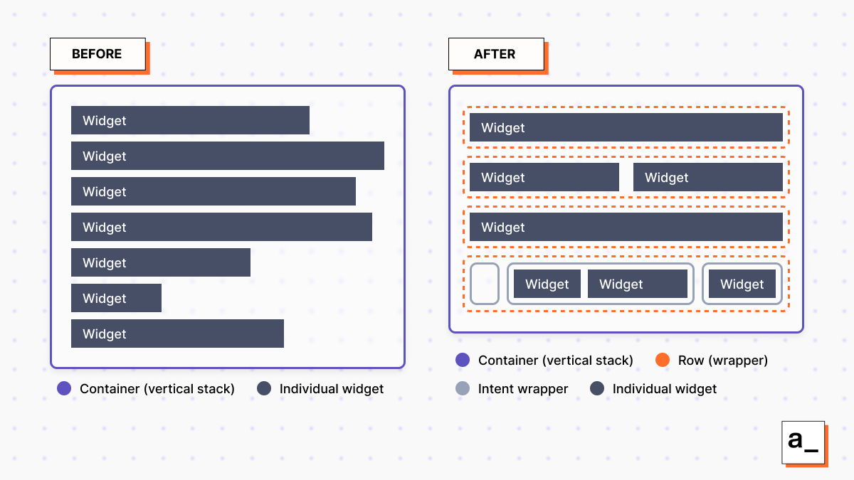 Intent-driven auto-layout is implemented by creating many hidden wrappers around widgets inside of containers. These wrappers are used to organize widgets that should be grouped together and standardize their sizes and positions.
For example, if you place a widget beneath another widget, Appsmith creates a new hidden row wrapper to hold the new widget. If you place a widget to the side of another widget, it adds the new widget to the existing row wrapper on the right or left of the existing widget. If you remove all the widgets in a row, the wrapper is automatically deleted without you even knowing about it.
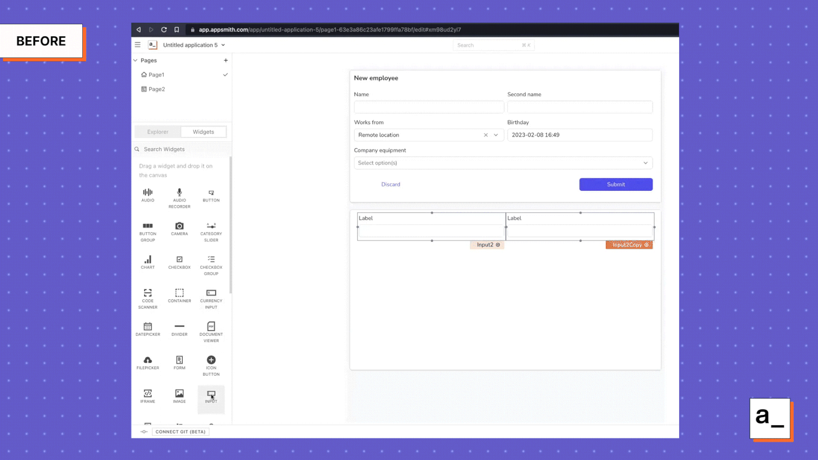
 Dropping an input below a previous input in a container places the new input underneath the row containing the existing input and automatically resizes the length of the label to take up the entire row.
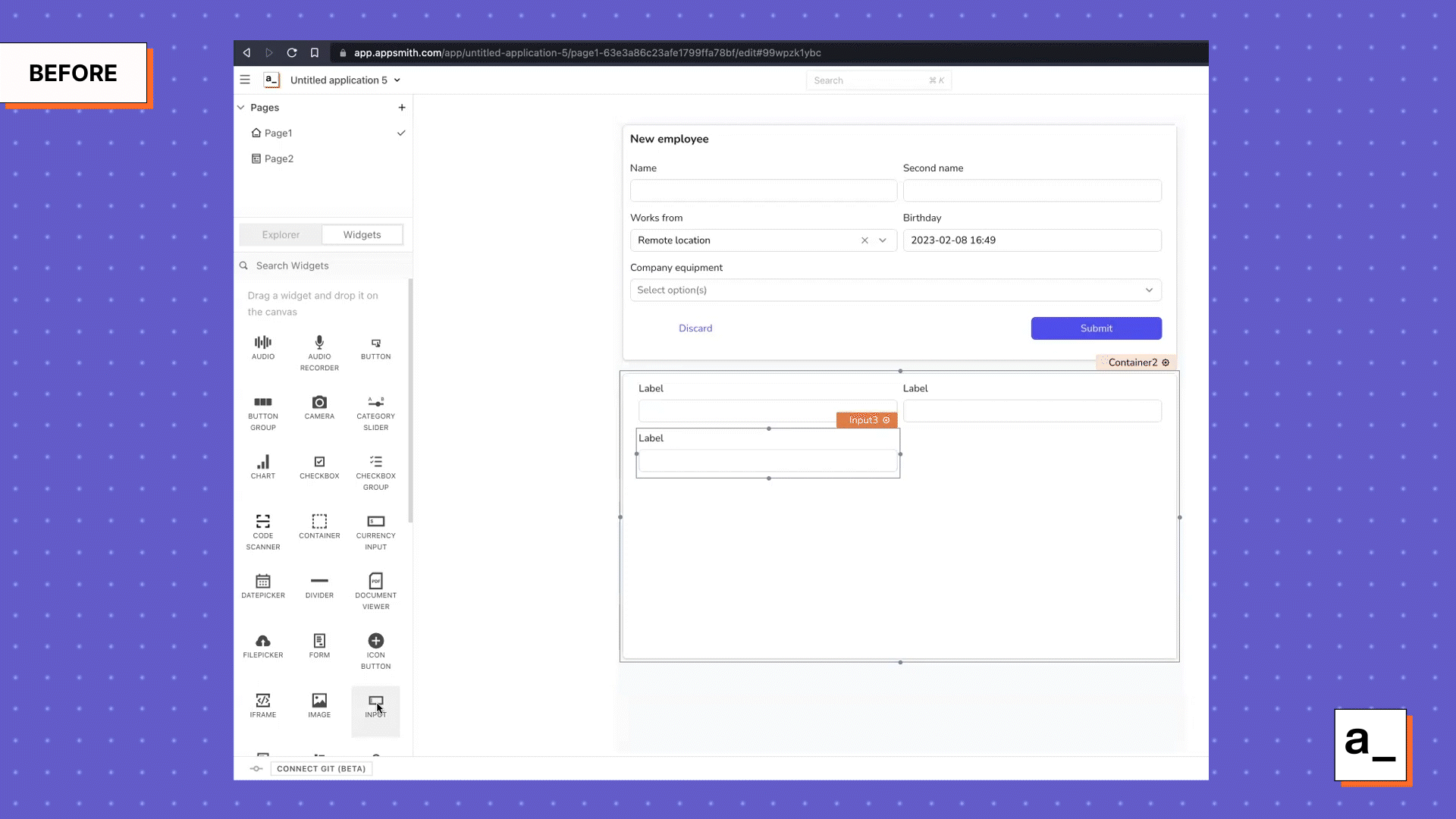
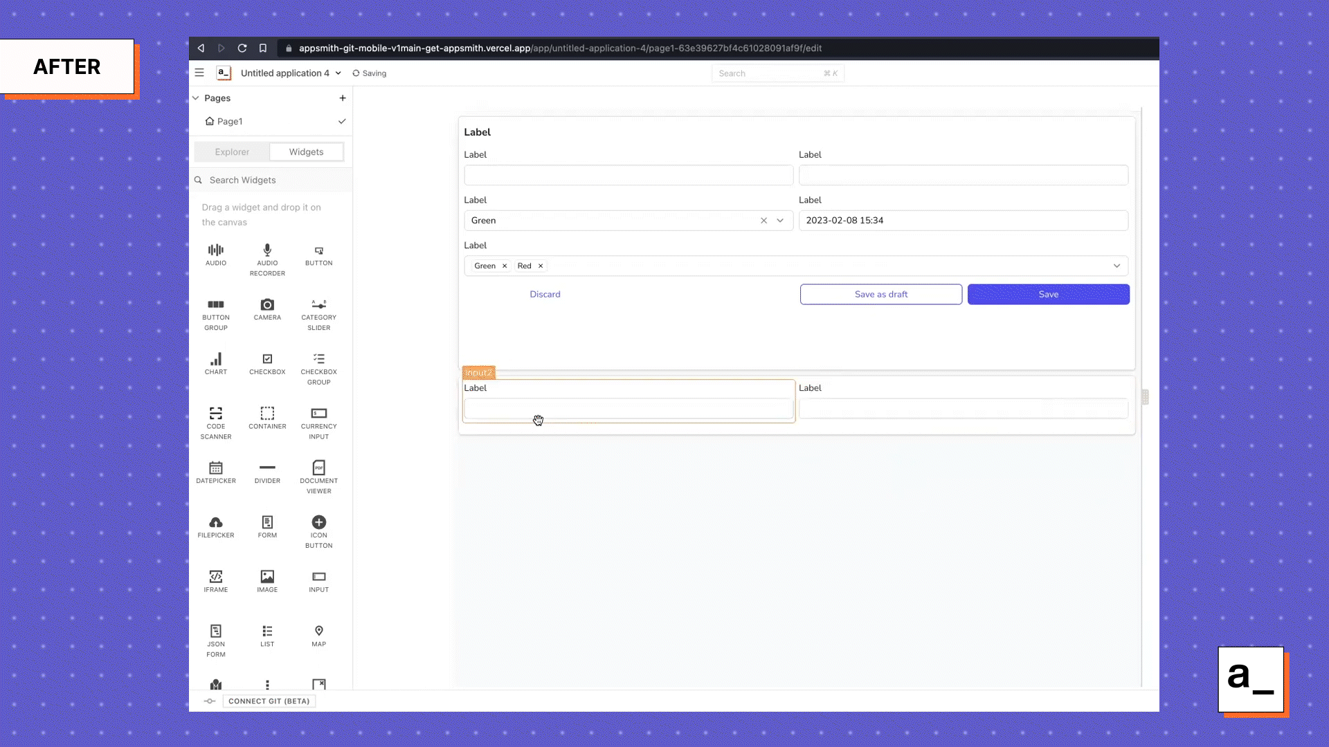
 Dropping an input widget on the right portion of the row automatically resizes it to do a 50/50 split between the two different inputs.
Automated reflow between desktop and mobile
After creating the basic auto-layout functionality, we needed a way to make it usable on mobile devices. We did this by making the rightmost column wrap down automatically after it reached a certain breakpoint, turning our two-column container into a single-column one. This helps us make sure the layout remains usable.
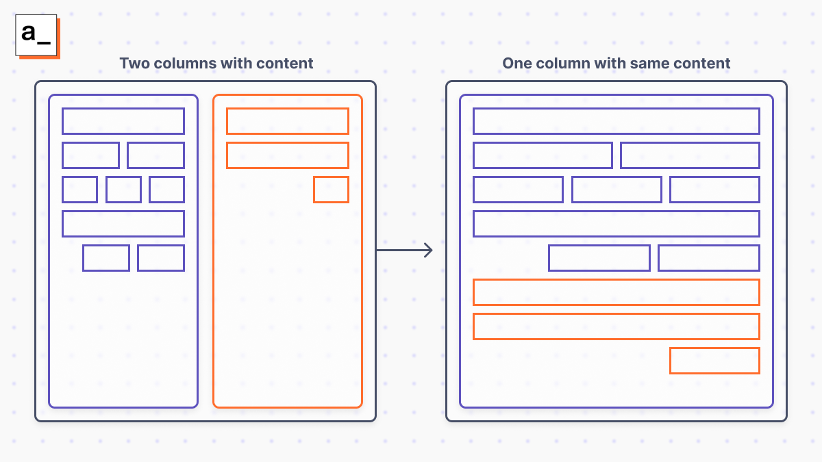 Users can create the two-column layout on Appsmith, and the auto-layout algorithm can automatically reformat the two-column layout to one column if the application is being run on a mobile device.
Container-splitting vs. cell-splitting
After we were comfortable with our mobile reflow logic, we wanted to try increasing the difficulty level and split our container into multiple columns. Equally-sized two-column layouts are the most common real-world scenario, but we wanted column space distribution ratios other than just 50/50 (otherwise we’d just place two container widgets side by side).
The only way to do that was to have columns inside a container with individual horizontal cells inside a column, all controlled with hidden wrappers. Saying this idea out loud even sounded scary. And if we tried to split individual cells (rather than whole containers) with different ratios we’d likely create even more problems for both ourselves and our users.
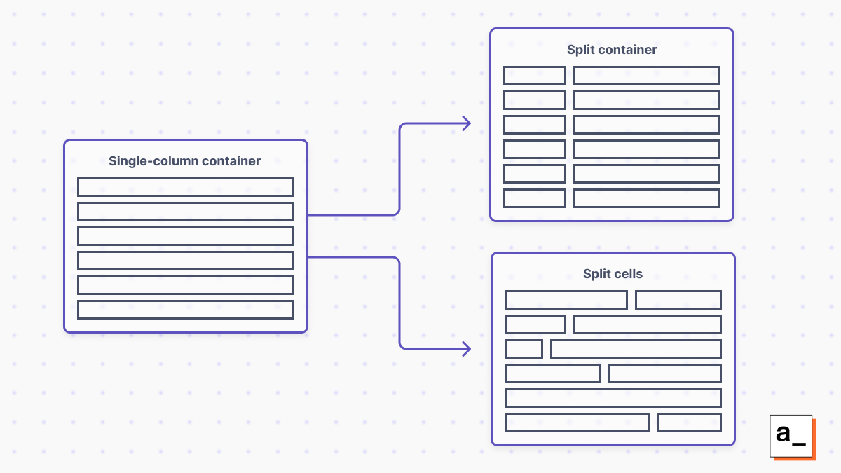 In order to move from a single column to multiple columns, the column information can be contained in each widget/cell (cell-splitting) or in the entire container around the cells/widgets (container-splitting).
So we decided to proceed with a feature that allows us to split the container into two columns with three possible ratios: 25/75 per cent, 50/50 and 75/25, as these should be all that anyone needs. This work isn’t quite finished yet, but will be available soon.
We want to build the best app development studio possible — want to help?
Appsmith’s new auto-layout functionality allows you to quickly build attractive, functional apps that work across all screen sizes without having to resort to pixel pushing. Our app studio automatically does the heavy lifting behind the scenes to place objects where you want on the canvas and automatically reflow your UI depending on device.
This is just one step in our ongoing journey to make internal app development as easy and seamless as possible. So far, we’ve focused on the layout behavior of the container widget. Our next job is to roll this behavior out to the entire canvas and other widgets. These improvements will multiply the benefits with each iteration while making sure not to break any of the thousands of existing apps built on Appsmith.
If you have any ideas — Appsmith-specific or not — about how we could make app development even better, come and join us on Discord. Appsmith is part of a huge open-source community of internal app developers, so we want to hear your story!
Cover artwork by Jemma Jose
