Build a WooCommerce Sales Reporting Dashboard
Building an online store with WooCommerce is incredibly easy. It allows you to upload your products, set up stock and downloadable products, and track orders and customer data.
And it is all free. So it's not surprising that many people use it and love it.
But getting reports out of it is hard sometimes. Their default reporting tools, often, don’t show all the information you need. And customizing it is incredibly complex.
A Faster Way to Build a Sales Reporting Dashboard on WooCommerce
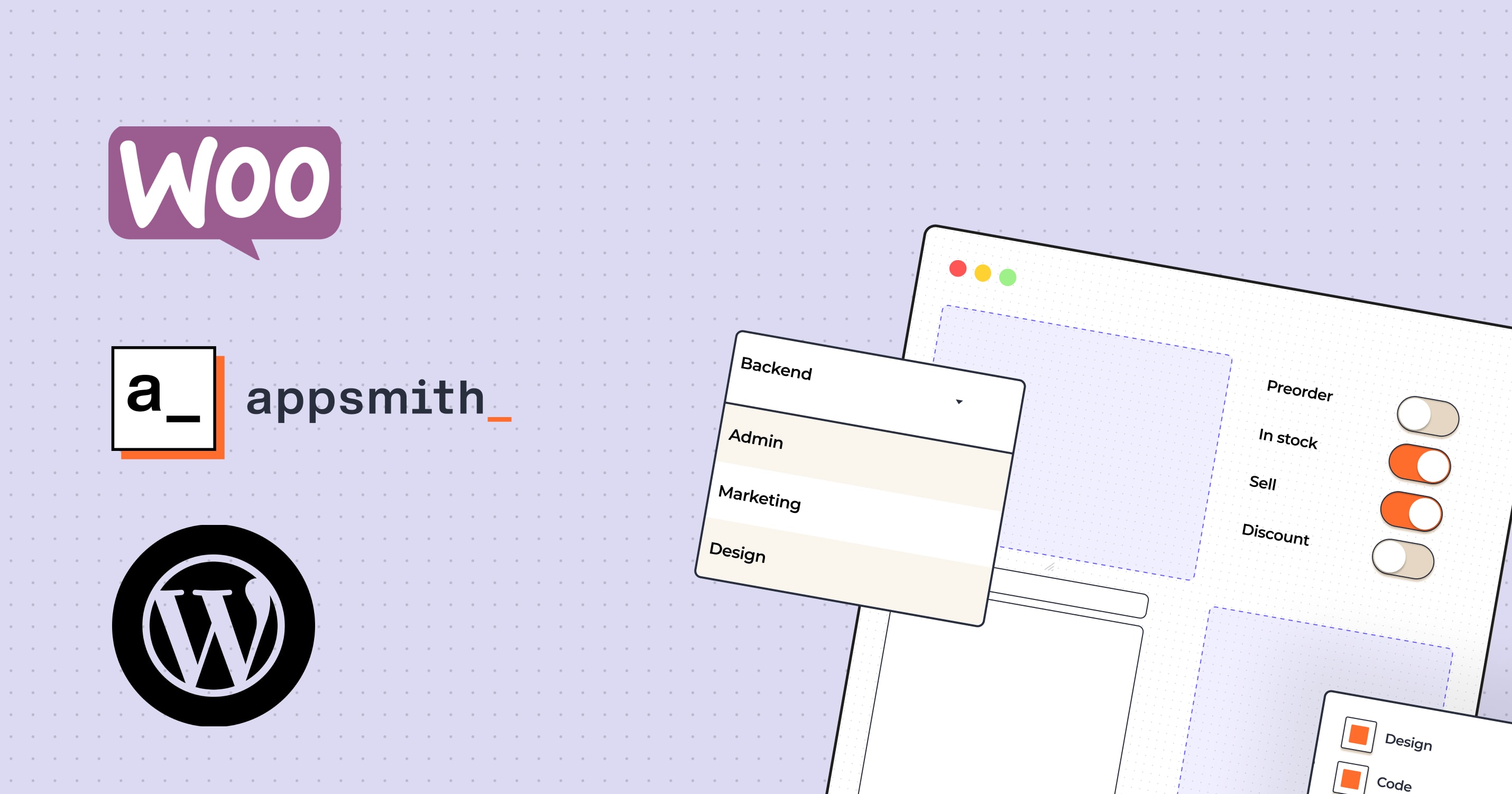
A faster approach is to build a reporting dashboard using Appsmith. This allows you to create fully customized reports, and it’s easy to add new elements or edit the current ones.
Therefore, our goal today is to improve WooCommerce and WordPress analytics. We will use Appsmith to read your database and build a sales reporting dashboard.
Along with the dashboard, we will explore many aspects of Appsmith and how to read external databases with it.
What Will the WooCommerce Dashboard Accomplish?
Reading external databases
Preprocessing your data
Building your Appsmith dashboard
Working with different time spans in your widget's data
Reading WooCommerce data
Creating line charts, bar charts, map charts
Displaying stats box with our main KPIs
Tables and lists with products and customers rankings
Let’s get started!
You can check out the final app here. You can fork it and build your app using your database.
Main Features of the Sales Reporting Dashboard
Before we start building, let’s walk through the app's main features.
The time selector
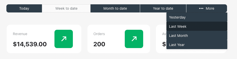
This button group allows you to select different timeframes in your queries. It allows you to check partial periods as well as completed periods quickly.
In addition, it is created in a way that you can easily extend it and add custom time selectors if you want (from X date to Y date).
The KPIs
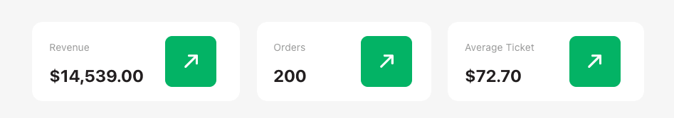
The KPIs show you a quick overview of your primary metrics. You can use the ones we’ve created or create your metrics.
Overview charts
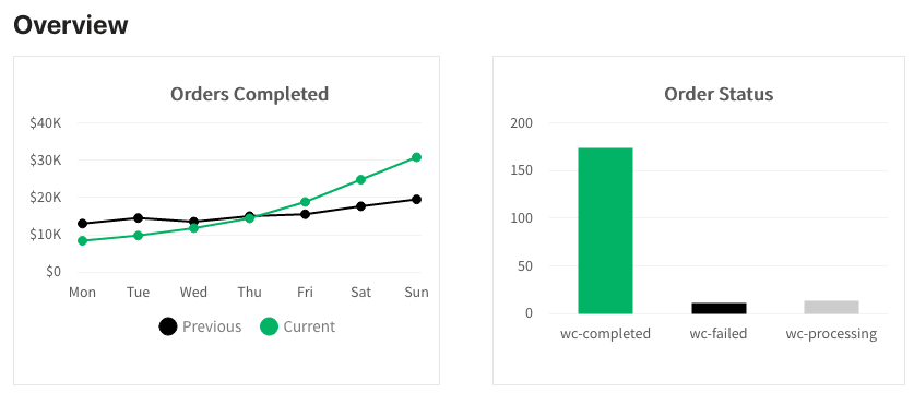
These charts allow you to quickly see orders for the selected period and how they compare to previous periods. This is the hardest part to implement in coding, but we have some excellent tips to make it much more manageable.
The Map Chart
This map allows you to see your top performing countries, with labels on hover. It is quite an interesting element. It has some technical challenges as well, but it creates a useful visual element for online stores.
Products Ranking
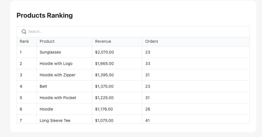
The product ranking allows you to see which are your top-performing products quickly. This is vital information for store owners, and you can get many insights from it.
Customers Ranking
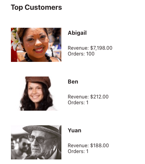
Likewise, the top customers list shows your best customers and how much they spend. You can use this information to reward them or find other customers with the same profile.
Now let's get to putting the UI together, but for that, we need to plan what our app will look like.
Create a Wireframe
Before coding your dashboard, you need a plan. There are many tools, from low-tech and reliable pen and paper to fancy design tools.
Another tool that might work well for you is Appsmith itself. You can use it as a prototyping tool. In this phase, you drag and drop the components you want to use on your page. Then you order them according to what makes the most sense for your decisions.
The wireframe is just like the final design in our demo, but with no data connections.
In addition to getting a feel of how your dashboard looks like, you can check two other points with your wireframe:
What kind of interactivity and functions do you need to create
What data source and in what format do you need
The first point is solved with some JS functions. The second one is solved with the DB connections.
WordPress and WooCommerce Data Structures
Now that you know what your app looks like, it's time to check your data structures. Since we are going to read data from WordPress directly, you have three options:
A direct database connection
REST API connections
Using a database that mirrors your main DB
The first option is the simplest. That's what we are going to do today. You can add your DB connection to Appsmith, and you are good to go.
The second option might work better depending on the data you want to load. If it is public data (which isn't the case for orders), this can be a quick solution, in particular, if you don't own the data source.
There are options to create custom API endpoints and authenticated requests. But this can get complex quite quickly. So make sure that this is the best option if you want to go for it.
The third option is an exciting one. In it, you can copy your database to another place. This allows you to pre-process your data if you want, reducing the stress on your main server. This might be a good option if you have too much data.
The downside is that you are always working with past data. Since you need to schedule this "mirroring" process, you are usually limited to doing it a couple of times per day.
Look-up Tables
You know the drill if you've worked with WordPress and WooCommerce before.
The data structures in WordPress are pretty hard to read, and WooCommerce makes it all the more complex.
This is where 'lookup tables' feature comes in.
They have been introduced in WooCommerce to solve performance issues. They are pre-processed versions of the most common WooCommerce queries you run, making it much faster. So, instead of checking the postmeta table, finding the post, then finding the user, you can look at the customer_lookup table, and it's all there.
There are many tables on your WordPress site, but we are going to use these in our demo:
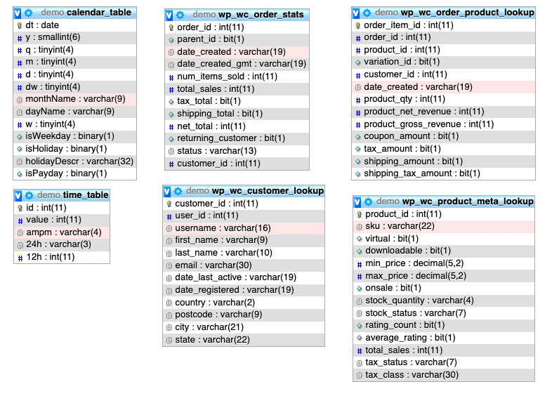
You might have noticed that we have two additional tables in addition to the lookup tables. Let’s talk about them now.
Auxiliary Tables: Calendar and Times
It is common to plot all dates, even if you have no data in it when it comes to reporting. After all, you don’t want a chart that skips dates, giving you the false impression that there are only good days.
For this reason, we need to calculate all possible dates and times. You can do it with JS functions, but it can get messy. Therefore, it’s much easier to create a calendar table with all possible dates using a SQL function.
This allows you to select all dates and then join your desired data (revenue, for example). The same goes for the hous of the day. Instead of manually calculating them, get the table with times and LEFT JOIN your desired data.
Data Manipulation
Since we are dealing with pre-made tables, which we don’t control, we must double-check if all the data we need is there.
For example, if you have a KPI for sales goals, do you have this stored on your site? If not, you need to find a way to store it.
In our case, all our data is there. It’s just a matter of finding which tables to load where.
There are many approaches to this, but one that works well is to go through each component and describe what kind of data you need to populate it. From there, you can even list the tables involved.
Here is how you could do it for the demo dashboard:
KPIs
Revenue - Sum of total sales from wp_wc_order_stats
Orders - Count of rows from wp_wc_order_stats
Average Ticket - Revenue / Orders
Orders completed chart
Get dates from the calendar or times
Left Join sum of total sales grouped by order date or time from wp_wc_order_stats
Order Status Chart
Get the sum of total sales from wp_wc_order_stats grouped by status
Orders Map
Get sum of total sales from wp_wc_order_stats
Left join country wp_wc_customer_lookup
Group by country
Products ranking
Get the sum of product revenue and count of orders from wp_wc_order_product_lookup grouped by product_id
Customers ranking
Get sum of order total from wp_wc_order_stats
Left join name from wp_wc_customer_lookup
Group by customer ID
As you can see, everything we need is there. Now it’s time to get our hands dirty.
Connecting the timeframe switchers
Let’s make the first component interactive. Drag and drop a button group to your page if you haven't already.
Next, add all options. You can create regular buttons (the main buttons) using the button type as simple, and you can create the “more” button using the menu type:
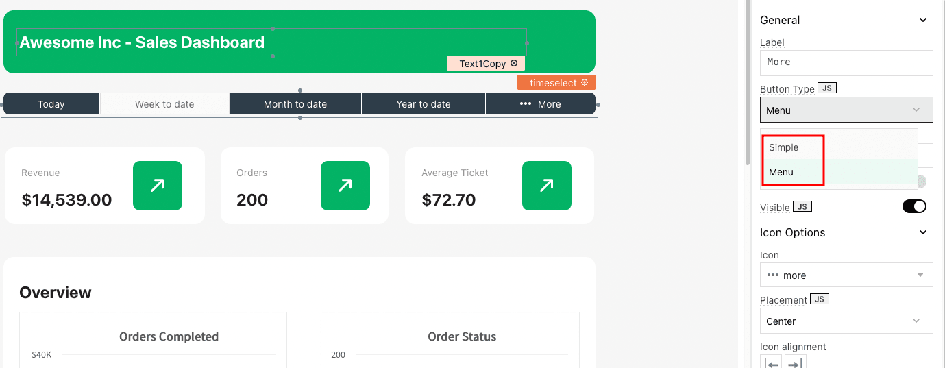
The menu type allows you to create sub-items for each menu item.
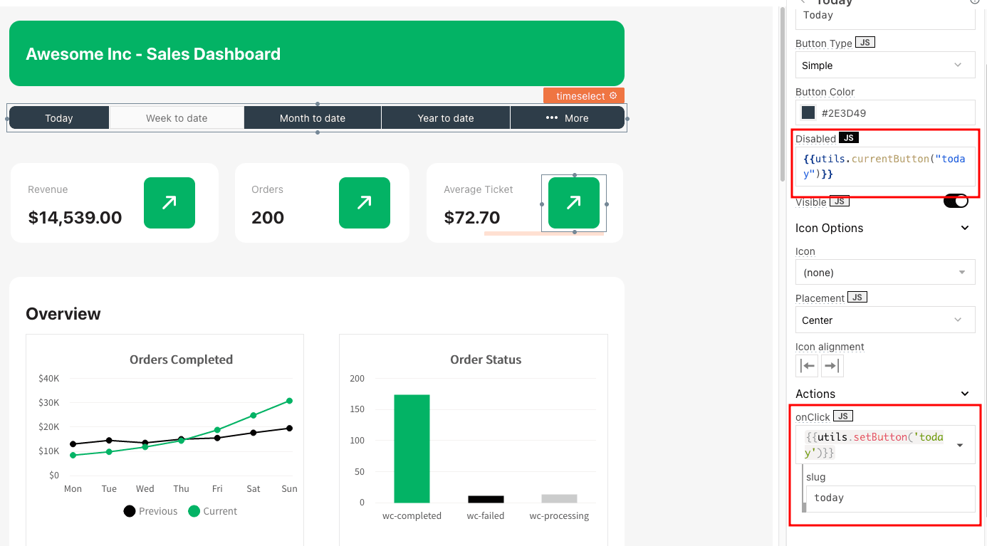
To mark a button as selected, we will use the “disabled” property. You can set it as “true”, “false” or as the result of some JS code. This allows you to assign dynamic values to your buttons.
You can create a new JS object, then add this code in it:
currentButton: ( slug = "" ) => { var ret = false; if ( slug == appsmith.store.button ) { ret = true; } return ret; }, This code just checks if the “slug” passed is the current button (stored in the appsmith.store.button variable). If it is the current button, it returns true, so the button is disabled. If it isn’t the current button, it returns false.
While you are at it, you can use this code to assign values to this “button” variable:
setButton: ( slug ) => { // possible values // today, (X to date) wtd, mtd, ytd, yesterday, (last X) lw, lm, ly storeValue( 'button', slug ); get_country_orders.run(); get_customers_ranking.run(); get_kpis.run(); get_linechart.run(); get_linechart_past.run(); get_orders_by_status.run(); get_product_ranking.run(); }In this case, you could simply use the storeValue function directly. But since we need to re-run all our queries, it’s better to pass the button action to a function, and in it we can do it all. Here we can save the button value and run each of our queries again, to update data when the value has changed.
Now you just need to edit each of your buttons and add the disabled value you want, along with the “onclick” function to save the button value:
Once you have this, you can play around and click your buttons; they should turn on and off automatically.
You need one more adjustment. When the page loads, there is no value assigned to this button. But we need it in all our actions. You can create a function to run on page load to assign a default value to it:
onLoad: async () => { if ( appsmith.store.button == null ) { storeValue('button', 'mtd'); } return appsmith.store.button; },Since this is an async function, you can click on the gear button next to it and enable “Run function on page load”:
The time limit is ready; now we need to use it. In this case, we use this function to generate the “where” part of all our queries. This is quite handy since you need to call this function whenever you have a time limit.
timeframe: ( type = "date_created", date_convert = false ) => { var time = appsmith.store.button, ret = [], dateCurrent = new Date(), dateMiddle = new Date(), datePast = new Date(), compare = "", offset = 0; dateMiddle.setUTCHours(0, 0, 0, 0); datePast.setUTCHours(0, 0, 0, 0); //default time = mtd time = ( time == null ) ? "mtd" : time; //if time is one of the "incomplete" types compare = ["today", "wtd", "mtd", "ytd"]; if ( compare.includes( time ) ) { //current date (most recent records) is today (tomorrow just to load all items no exceptions) dateCurrent.setDate( dateCurrent.getDate() + 1 ); } else { // current date is the begining of the period (start of the day (yesterday), week, month, year) dateCurrent.setUTCHours(0, 0, 0, 0); //increase by one all further calculations offset = 1; //set day, week, month, year switch (time) { case 'lw': dateCurrent.setDate( dateCurrent.getDate() - dateCurrent.getDay() - 1 ); break; case 'lm': dateCurrent.setDate( 0 ); break; case 'ly': dateCurrent.setMonth( 0 ); dateCurrent.setDate( 0 ); break; } } if ( time == "today" || time == "yesterday" ) { dateMiddle.setDate( dateMiddle.getDate() - offset ); datePast.setDate( datePast.getDate() - 1 - offset ); } if ( time == "wtd" || time == "lw" ) { dateMiddle.setDate( dateMiddle.getDate() - ( offset ) * 7 - dateMiddle.getDay() - 1 ); datePast.setDate( datePast.getDate() - ( 1 + offset ) * 7 - datePast.getDay() - 1 ); } if ( time == "mtd" || time == "lm" ) { dateMiddle.setDate( 0 ); dateMiddle.setMonth( dateMiddle.getMonth() - offset ); datePast.setMonth( datePast.getMonth() - 1 - offset ); datePast.setDate( 0 ); } if ( time == "ytd" || time == "ly" ) { dateMiddle.setYear( dateMiddle.getFullYear() - offset ); dateMiddle.setMonth( 0 ); dateMiddle.setDate( 0 ); datePast.setYear( datePast.getFullYear() - 1 - offset ); datePast.setMonth( 0 ); datePast.setDate( 0 ); } type = ' ' + type + ' '; dateCurrent = ' "' + dateCurrent.toISOString().replace('T', ' ') + '" '; dateMiddle = ' "' + dateMiddle.toISOString().replace('T', ' ') + '" '; datePast = ' "' + datePast.toISOString().replace('T', ' ') + '" '; if ( date_convert == true ) { dateCurrent = " DATE(" + dateCurrent + ") "; dateMiddle = " DATE(" + dateMiddle + ") "; datePast = " DATE(" + datePast + ") "; } ret.push( type + ' < ' + dateCurrent + ' AND ' + type + ' >= ' + dateMiddle ); ret.push( type + ' < ' + dateMiddle + ' AND ' + type + ' >= ' + datePast ); return ret; },
Now you are ready to load dynamic data! Let’s go through each of your components.
Loading data for the KPIs
As discussed earlier, the KPIs load the sum of all sales in the current period. You can do it with this SQL query:
SELECT SUM(total_sales) as "revenue", COUNT(order_id) as "orders" FROM wp_wc_order_stats WHERE {{utils.timeframe()[0]}}
Notice how we use the timeframe function with the current period as an argument.
This is the output for that query:
[ { "revenue": 14539, "orders": 200 }]The revenue returns just a number though. Since we are using currency formatting in many different places, you can use this function in your JS object:
currencyFormat: (n) => { n = ( n || 0 ); return Intl.NumberFormat('en-US' , { style: "currency", currency: "USD", }).format(n); }Then, you need to replace the current value in your KPI boxes.
This is the revenue:
{{ utils.currencyFormat( get_kpis.data[0]["revenue"] ) }}This is the orders count:{{ get_kpis.data[0]["orders"] }}And this is the average ticket size:{{utils.currencyFormat(( get_kpis.data[0]["revenue"] / get_kpis.data[0]["orders"]) )}}That’s it! Your KPIs are ready
Create Orders Completed and Order Status Charts
Appsmith comes with some preset charts. But if you need custom charts, you can use any fusion chart you want.
You need to select the “custom chart” option and then pass the arguments as defined by fusion charts.
If you need multi-series data in a line format, you can use the msline chart. That’s what we use for the main sales chart.
This is what we use in the custom fusion chart field for that component:
{ "type": "msline", "dataSource": { "chart": { "caption": "", "subCaption": "", "xAxisName": "", "yAxisName": "", "numberPrefix": "$", "labelStep": {{ (get_linechart_past.data.length / 7) }}, "plotFillAlpha": "100", "theme": "fusion", "lineColor": "03B365", "anchorBgColor": "03B365" }, "categories": [ { "category": {{ get_linechart_past.data }} } ], "dataset": [ { "seriesname": "Previous", "color": "#000", "anchorBgColor": "#000", "data": {{ get_linechart_past.data }} }, { "seriesname": "Current", "data": {{ get_linechart.data }} } ]}} The central aspect of this chart is that you need a setup, then your categories, and then your data series as arrays. In this case, we use the past data as the labels (since they have a complete series at all times), and we use current and past data in the datasets.
These datasets are created with 2 queries, but these queries just load a JS function. For the current data:
{{utils.queryBuild()[0]}}And for past data:{{utils.queryBuild()[1]}}In this function we make use of the time limits set in our functions and build our queries.queryBuild: () => { // builds queries for the line chart // return [current, past] // utils.timeframe( type = "date_created", date_convert = false ); var time = appsmith.store.button, ret = [], labels_table = "", labels_time_format = "", orders_time_format = "", labels_where = [ " 1 ", " 1 "], orders_where = utils.timeframe( ), query = ""; //defaulttime = mtd time = ( time == null ) ? "mtd" : time; //selectif we are plotting data from calendar_table (dates, weeks, months) or time_table (hours) if ( time == "today" || time == "yesterday" ) { labels_table = "time_table"; } else { labels_table = "calendar_table"; labels_where = utils.timeframe( "dt", true ); } labels_table = ' ' + labels_table + ' '; //select the column that is the time_format for the labels and orders switch (time) { case 'today': case 'yesterday': labels_time_format = ' value as "time_format", 24h as "label" '; orders_time_format = ' HOUR(date_created) as "time_format" '; break; case 'wtd': case 'lw': labels_time_format = ' dt as "time_format", dayName as "label" '; orders_time_format = ' DATE(date_created) as "time_format" '; break; case 'mtd': case 'lm': labels_time_format = ' dt as "time_format", CONCAT(d, " ") as "label" '; orders_time_format = ' DATE(date_created) as "time_format" '; break; case 'ytd': case 'ly': labels_time_format = ' m as "time_format", monthName as "label" '; orders_time_format = ' MONTH(date_created) as "time_format" '; break; } //build main query query += " SELECT tm.label, orders.value FROM "; // calendar select query += "("; query += ' SELECT *, ' + labels_time_format + ' FROM ' + labels_table + ' WHERE ' + labels_where[0] + ' GROUP BY time_format '; query += ") as tm "; // orders select query += " LEFT JOIN ("; query += 'SELECT *, ' + orders_time_format + ' , SUM(total_sales) as "value" FROM wp_wc_order_stats WHERE ' + orders_where[0] + ' GROUP BY time_format'; query += ") as orders "; // end query query += " ON tm.time_format = orders.time_format "; ret.push(query); //build past query query = ""; query += " SELECT tm.label, orders.value FROM "; // calendar select query += "("; query += ' SELECT *, ' + labels_time_format + ' FROM ' + labels_table + ' WHERE ' + labels_where[1] + ' GROUP BY time_format '; query += ") as tm "; // orders select query += " LEFT JOIN ("; query += 'SELECT *, ' + orders_time_format + ' , SUM(total_sales) as "value" FROM wp_wc_order_stats WHERE ' + orders_where[1] + ' GROUP BY time_format'; query += ") as orders "; // end query query += " ON tm.time_format = orders.time_format "; ret.push(query); return ret; }The entire function is quite long, but the entire logic can be summarized as follows:
Check if we load data from the calendar (dates) or the timetable
LEFT JOIN data from orders, grouped by the time restriction
Apply the time restriction in both queries
Return 2 queries (an array), one for the current selection and one for the past selection.
The orders by a status chart are created using a columns2d chart.
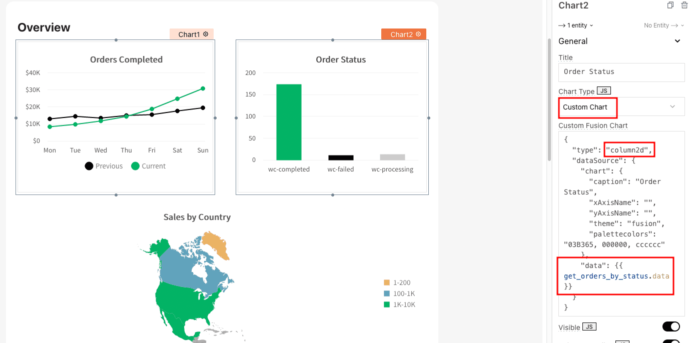
You can define your options such as axis names, palette colors, and captions in it.
Then, you need to pass the charts data. This is the query to load orders by status:
SELECT status as "label", COUNT(order_id) as "value" FROM wp_wc_order_stats WHERE {{utils.timeframe()[0]}} GROUP BY status
And this is the result:
[ { "label": "wc-completed", "value": 174 }, { "label": "wc-failed", "value": 12 }, { "label": "wc-processing", "value": 14 }]You can see that the query is crafted with the chart in mind. Therefore, we need to return the label and value comuns, as per the widget.
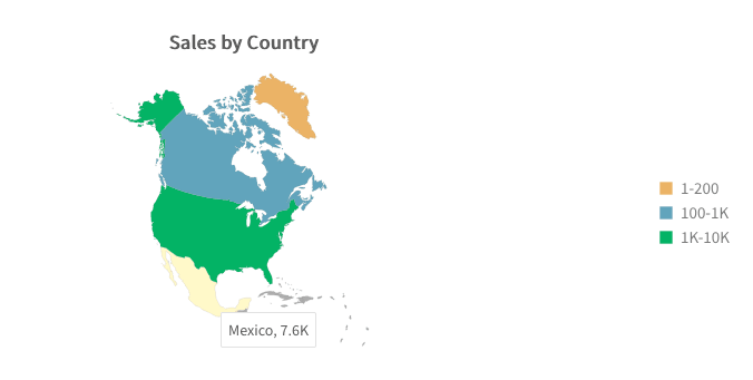
Sales map chart
The map charts have options that significantly affect how your data is presented. Check it out:
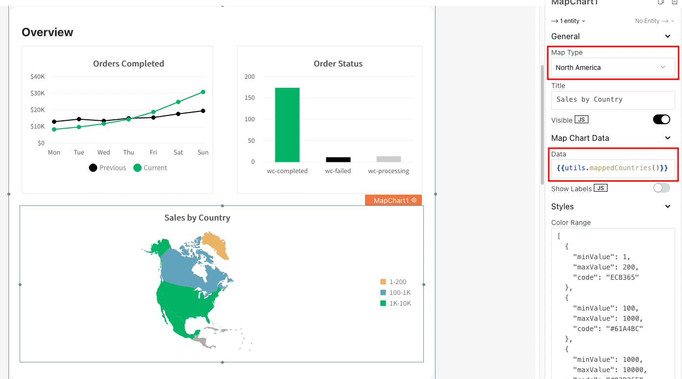
You can pick the map type from a list of values. Some maps expect country IDs (from the fusion charts table), and some expect continents labels.
We call a function that does this mapping process for us to make things easier.
This is the SQL query to load data for the map charts:
SELECTSUM(rev.revenue) as"c_revenue", SUM(rev.orders) as"c_orders", nm.countryas"country"FROM

( SELECT *, SUM(total_sales) as"revenue", count(order_id) as"orders"FROMwp_wc_order_statsWHERE {{utils.timeframe()[0]}} GROUPBY customer_id ORDERBYrevenueDESCLIMIT20) as rev
LEFTJOIN
( SELECT * FROMwp_wc_customer_lookup  ) as nm

ONrev.customer_id = nm.customer_idGROUPBYnm.country
This might seem complex, but this is what we are doing:
SELECT SUM of all revenue, SUM of all orders count, Country codes FROM
Wp_wc_order_stats (where you get all orders, sum of revenue, orders count)
LEFT JOIN wp_wc_customer_lookup (where you get the country code for your customers/orders)
GROUP BY Country code
Therefore, we get data from Wp_wc_order_stats (revenue) then we load the wp_wc_customer_lookup to know which country that order is from. Next, we group the result by country.
But this query generates a result that isn’t what the fusion charts component expects. Here is an example:
[ { "c_revenue": 759, "c_orders": 5, "country": "CA" }, { "c_revenue": 168, "c_orders": 1, "country": "GL" }, { "c_revenue": 7595, "c_orders": 103, "country": "MX" }, { "c_revenue": 1488, "c_orders": 10, "country": "US" }]Therefore, we need to translate this data into their format. We can do it with array mapping. We use these 2 functions for that:
[ { "c_revenue": 759, "c_orders": 5, "country": "CA" }, { "c_revenue": 168, "c_orders": 1, "country": "GL" }, { "c_revenue": 7595, "c_orders": 103, "country": "MX" }, { "c_revenue": 1488, "c_orders": 10, "country": "US" }]You can modify these functions to add more options (countries, continents) and manipulate data in other ways (for example, plot order count instead of revenue).
Either way, now, when you call utils.mappedCountries, you get all countries in the exact format you need.
A final touch is just creating chart labels in your desired format. Here is an example:
[ { "minValue": 1, "maxValue": 200, "code": "ECB365" }, { "minValue": 100, "maxValue": 1000, "code": "#61A4BC" }, { "minValue": 1000, "maxValue": 10000, "code": "#03B365" }]Products Ranking
The product ranking is just a query that loads all orders within the timeframe selected. Then it groups all these orders by product ID, summing the order values and counting the number of orders.
It seems simple enough, but what about the ranking?
You can do it with some JS code, but you can include it in your SQL query if you want.
Here is how you can do it:
SET @rownum = 0;SELECT @rownum:=(@rownum+1) as"rank", rev.revenue, rev.orders, nm.titleFROM( SELECT *, SUM(product_net_revenue) as"revenue", count(order_id) as"orders"FROMwp_wc_order_product_lookupWHERE {{utils.timeframe()[0]}} GROUPBY product_id ORDERBYrevenue DESC ) as revLEFT JOIN( SELECT post_title as"title", IDFROMwp_posts ) as nmONrev.product_id = nm.IDIn this query, we set a variable (rownum), and for each row, your database adds one to it ( @rownum:=(@rownum+1) ).
The selection itself is similar to what we did before; the only adjustment is that we load the product name from the wp_posts table.
Then you can add this query to your table:
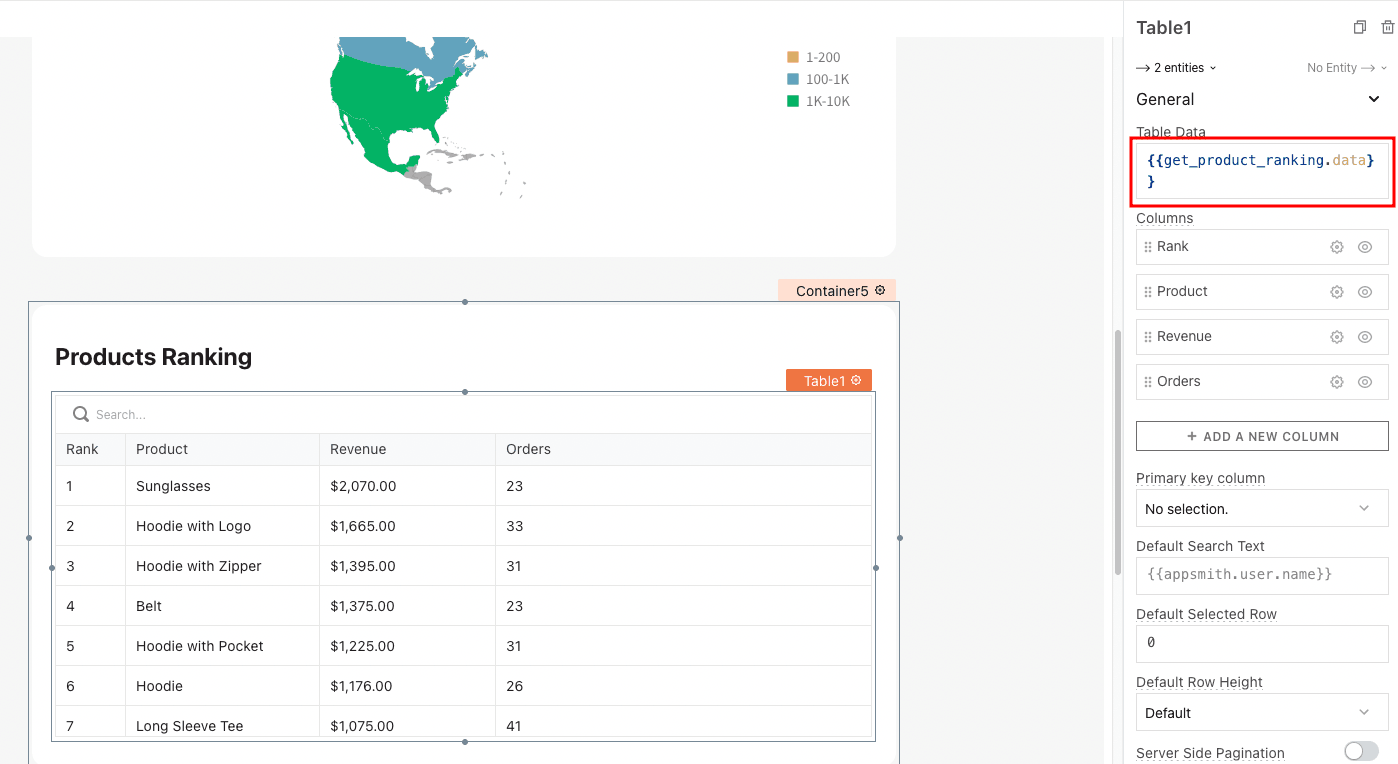
You can adjust the column names, and adjust the revenue to be set as:
{{utils.currencyFormat(currentRow.revenue)}}This function converts the revenue value to currency.
Customers Ranking
The customers' ranking is very similar to the products ranking. The only difference is that we are using a list this time.
In this case, you can load the customer gravatar if you want (loading the gravatar image for their email). In our demo dashboard, we load placeholder images.
This is the query to load the customers ranking:
SET @rownum = 0;SELECT @rownum:=(@rownum+1) as"rank", rev.revenue, rev.orders, nm.first_nameas"name"FROM( SELECT *, SUM(total_sales) as"revenue", count(order_id) as"orders" FROMwp_wc_order_statsWHERE {{utils.timeframe()[0]}} GROUPBY customer_id ORDERBYrevenueDESCLIMIT20) as revLEFT JOIN( SELECT * FROMwp_wc_customer_lookup ) as nmONrev.customer_id = nm.customer_idAnd you need to load its data in your list like this:
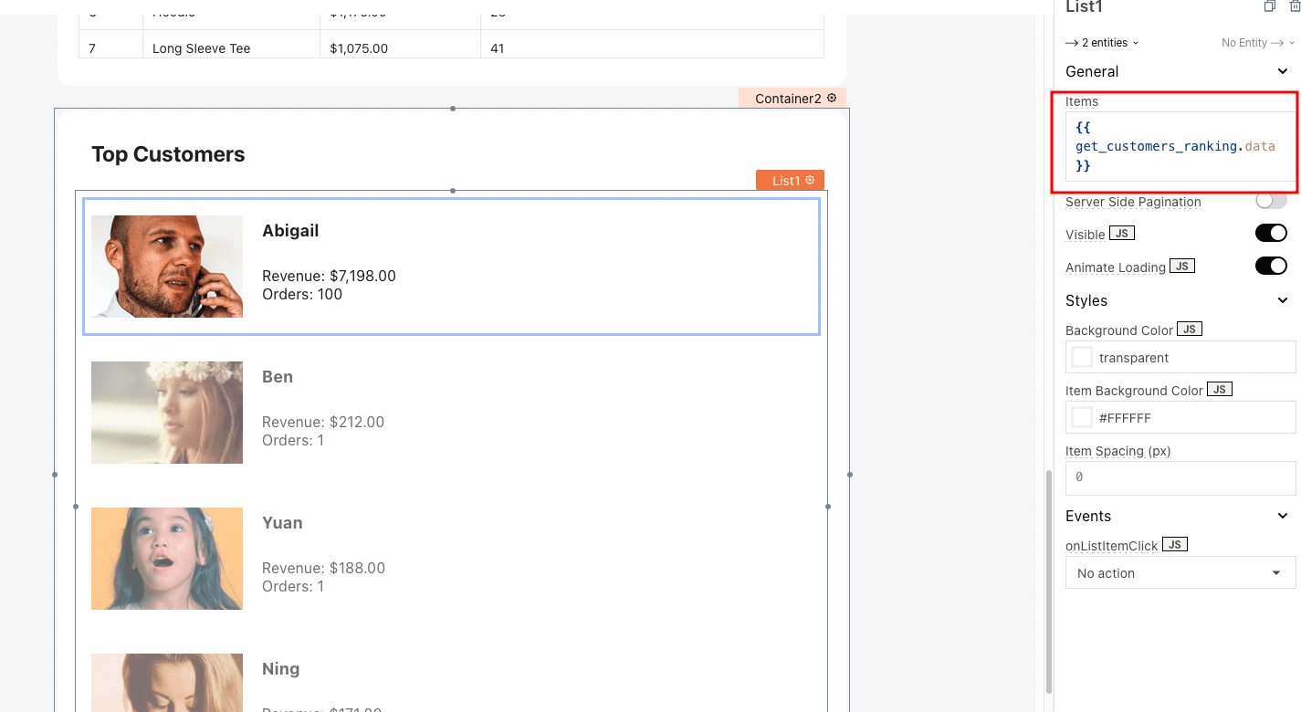
Similar to the table, you can reference the currentItem in your components to load data. For example, the revenue and orders field is set up like this:
Revenue: {{ utils.currencyFormat(currentItem.revenue) }}
Orders: {{ currentItem.orders }}
And that’s it! Your dashboard is ready.
Today we learned how to create a sales dashboard for WooCommerce sites. We discovered how to read data from WordPress and add it to different Appsmith widgets.
By the end of the day, you should be able to connect your WordPress site to Appsmith, creating your widgets. We didn’t cover some aspects of applications (such as security) for educational purposes, but this should be a great starting point.
We hope you’ve enjoyed it, and see you again next time!