How to Visualize and Graph Data from Your PostgreSQL/MySQL/MongoDB Database in Under Five Minutes

Databases are powerful, well-perfected tools for storing and querying data but they usually don’t include user interfaces for browsing or visualizing data.
Third-party tools exist for data visualization, but many fall short in usability, especially for non-technical users, and are time-consuming to set up (usually involving manually exporting data and then using Excel to build graphs). You should instead be able to quickly and easily build your visualizations once and then see them updated in real time as your database is updated.
In this tutorial, you will learn how to visualize and graph data from PostgreSQL, MySQL, and MongoDB (or almost any other database) in under five minutes using Appsmith.
How to build data visualizations for your PostgreSQL or MySQL database using Appsmith
Appsmith is an app platform that allows developers to quickly spin up good-looking, fully-functional applications like admin panels, dashboards, and other internal tools. You can easily connect datasources, whether they are databases or APIs, and then quickly build a front end to browse, edit, and visualize that data. Appsmith has 40+ front-end widgets so that you can fully customize your user interface.
Appsmith is fully compatible with all of the most popular databases like PostgreSQL, MySQL, MongoDB, Snowflake, and MS SQL, as well as being able to interact with REST APIs and GraphQL. All databases and APIs are available as datasource integrations in the platform.
MySQL and PostgreSQL are the most popular databases in the world with developers at the moment. They have similar syntax, so for the purposes of this article, we’ll use Appsmith’s sample PostgreSQL — but everything will work just the same for MySQL.
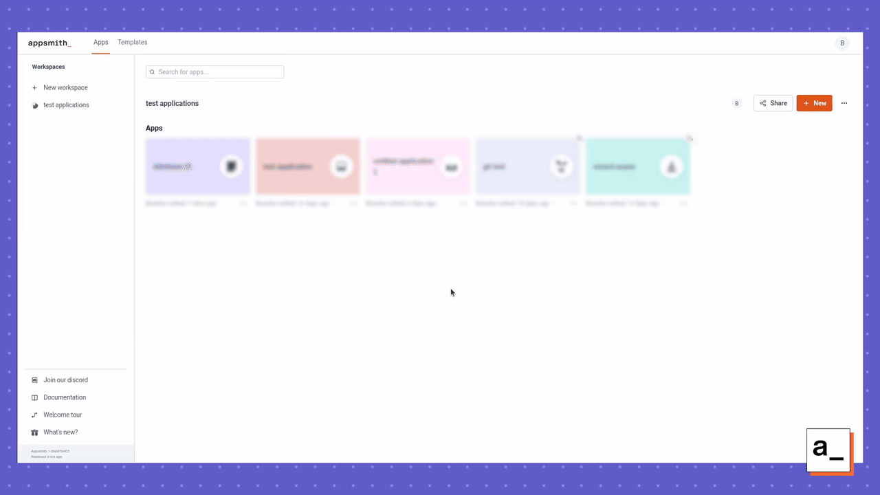
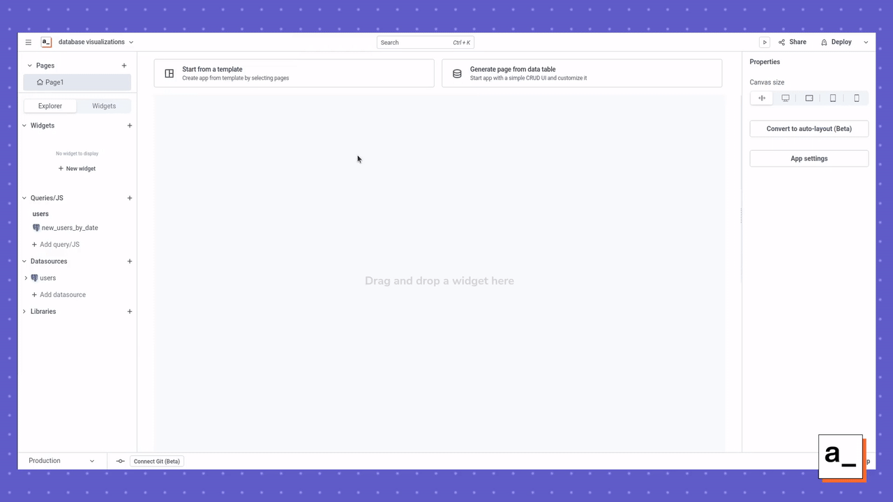
Before you get started, you need to sign up for Appsmith and create an application. You can sign up for the free cloud-hosted version to get up and running quickly. You also have the option to self-host using a variety of methods. After you sign in, create a new application and give it a name.
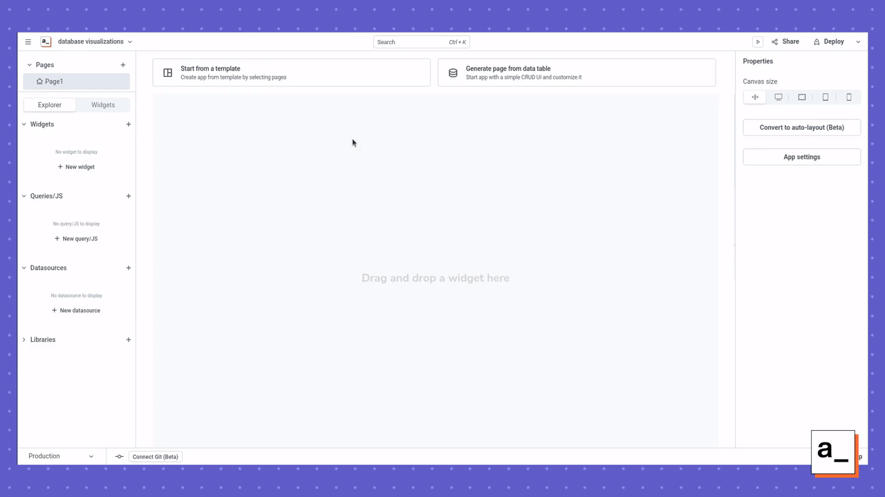
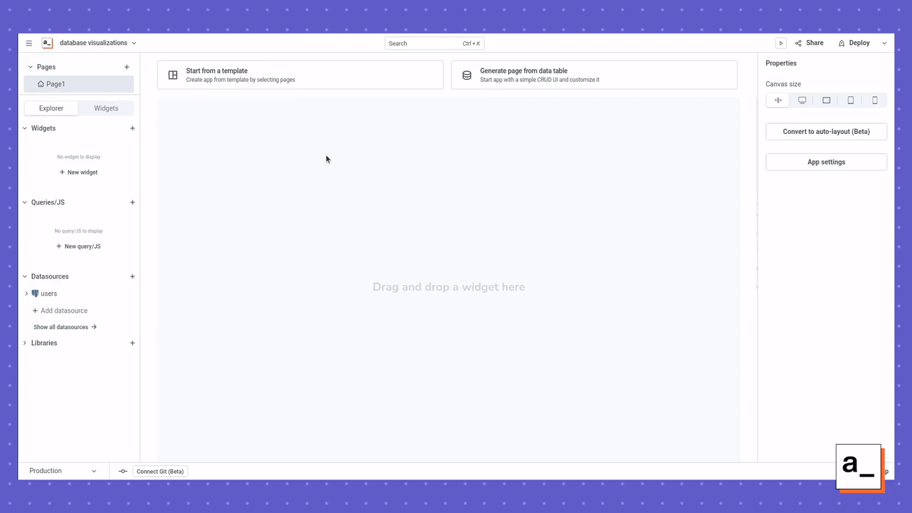
After you’ve created your application, it only takes three steps to create a visualization for your PostgreSQL or MySQL database.
Step 1: Connect to the MySQL database
On the left sidebar, find the Datasources section and click the + button to add a datasource. For this tutorial, you can use the sample users database that is provided to all Appsmith users.
Since you’ll be using sample data for this tutorial, you don’t need to supply any credentials. But if you select a live datasource, you’ll see a screen that looks something like this (depending on which datasource you choose). After you supply the credentials and click Save, it will be added under the Datasources for your application.

Step 2: Add a new query to retrieve your data
Once you’ve added your database as a datasource, you can create new queries on that database. You can do this by clicking the + button in the Queries/JS section on the left-hand side.
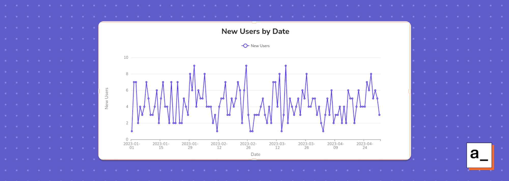
Here, you’ll see the default SQL query that you can customize. You should also name the query in a way that you’ll recognize later when building your front end. For this example, name this query new_users_by_date, to describe what this query will capture from the database.
Replace the default query with the query below, then click Run to verify that it works. You can quickly test and tweak queries as much as you want by clicking Run, ****seeing the output in the console at the bottom, then adjusting as needed.
**SELECT** date("created_at"), **count**("name") **FROM** public."users" **GROUP** **BY** date("created_at") **ORDER** **BY** date("created_at") **ASC**;
Step 3: Add a widget to visualize your data
Now that your query is working, you can build the front-end widget to display the results. Do this by going to the Widgets section on the left side of the screen, clicking the + button, and searching for the Chart widget. You can then drag and drop that widget onto the canvas.
You need to set the following fields in the Chart widget to display and label the data correctly:
Chart type:
Line Chart
General Title:
New Users by Date
Series Title:
New Users
x-axis label:
Date
y-axis label:
New Users
After adding the Chart widget to the canvas, you must map the query to format the data into x and y values that the line chart can plot. Do this by adding the following JavaScript code to the Series data field of the widget, as described in the Chart widget documentation.
{{new_users_by_date.data.map( p => ({x: p.date, y: p.count}))}}
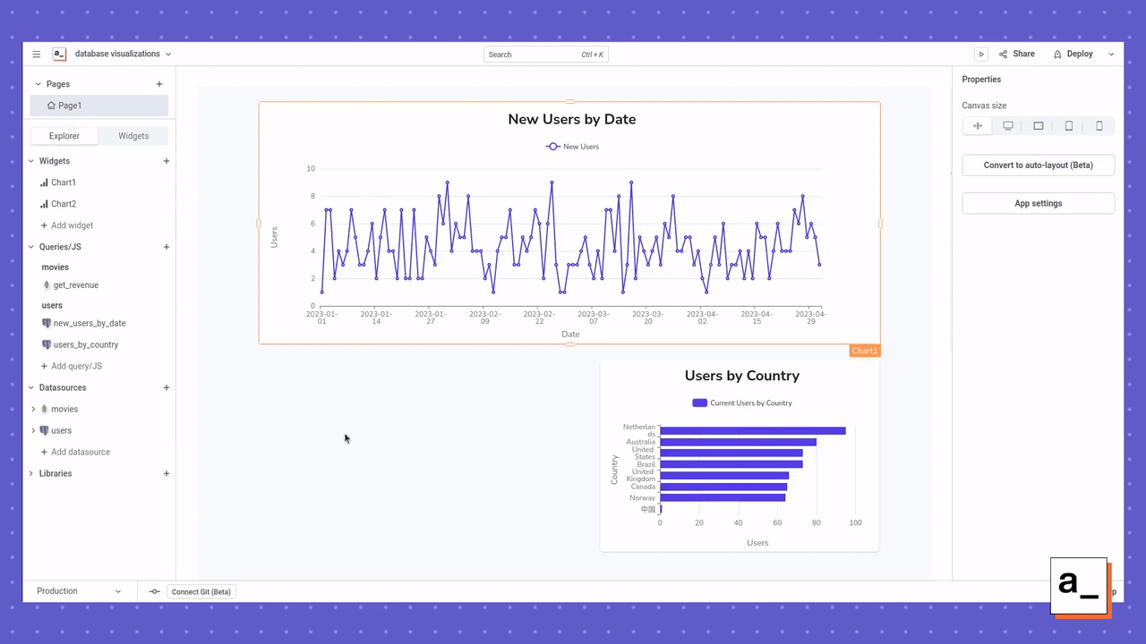
Afterwards, your line chart should look something like this:
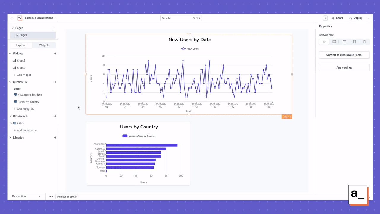
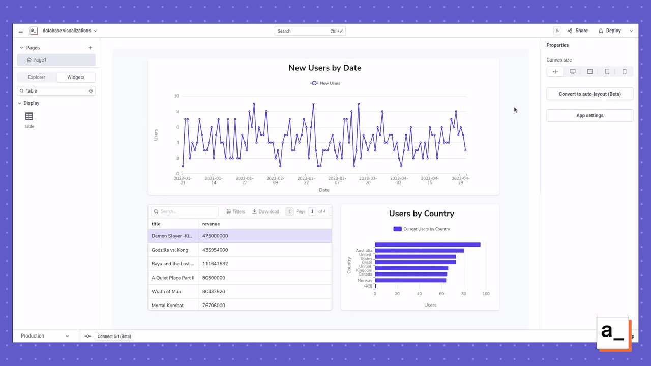
Add additional visualizations to your dashboard
You now have a functional visualization for a MySQL or PostgreSQL database and can follow the simple three-step process from above to continue adding more datasources, queries, and widgets to your application. In this tutorial, we’ll show you how to add two more queries and widgets just to demonstrate the other types of visualizations that you can build.
Visualizing current users by country
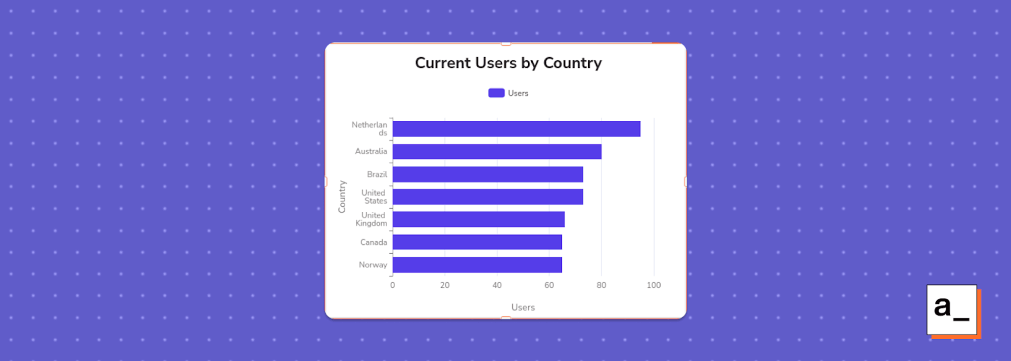
This example uses the same datasource as the previous steps and groups the current users by country. To do this, create a query named users_by_country:
SELECT "country", count("name") FROM public."users" GROUP BY "country" ORDER BY "count" ASC;
This query can also be visualized using a Chart widget, but the fields must be adjusted:
Chart type:
Bar Chart
General Title:
Current Users by Country
Series Title:
Users
x-axis label:
Users
y-axis label:
Country
In order to display the data correctly, you will also need to update the Series Data field of the Chart widget with the following JavaScript to correctly map the data.
{{users_by_country.data.map( p => ({x: p.country, y: p.count}))}}
After that, the bar chart should look something like this:
Bonus round! Visualizing data from MongoDB
MongoDB is a non-relational database, which is the main alternative to relational databases like MySQL and PostgreSQL. Appsmith includes a sample MongoDB database of movies, which you can find when adding a datasource. In this example, we’ll show you how to visualize the revenue per movie from this sample database.
Because this is a non-relational database, you’ll need to structure the query differently than for MySQL or PostgreSQL. The query below, named get_revenue, grabs all documents within the movies collection of the movies database that have a valid title and revenue. It then sorts in descending order based on revenue and then returns the title and revenue of each result.
Command:
Find document(s)
Collection:
movies
Query:
{
revenue: { $exists: true, $ne: null },
Sort:
{"revenue": -1}
Projection:
{ title: 1, revenue: 1, _id: 0 }
Limit:
100

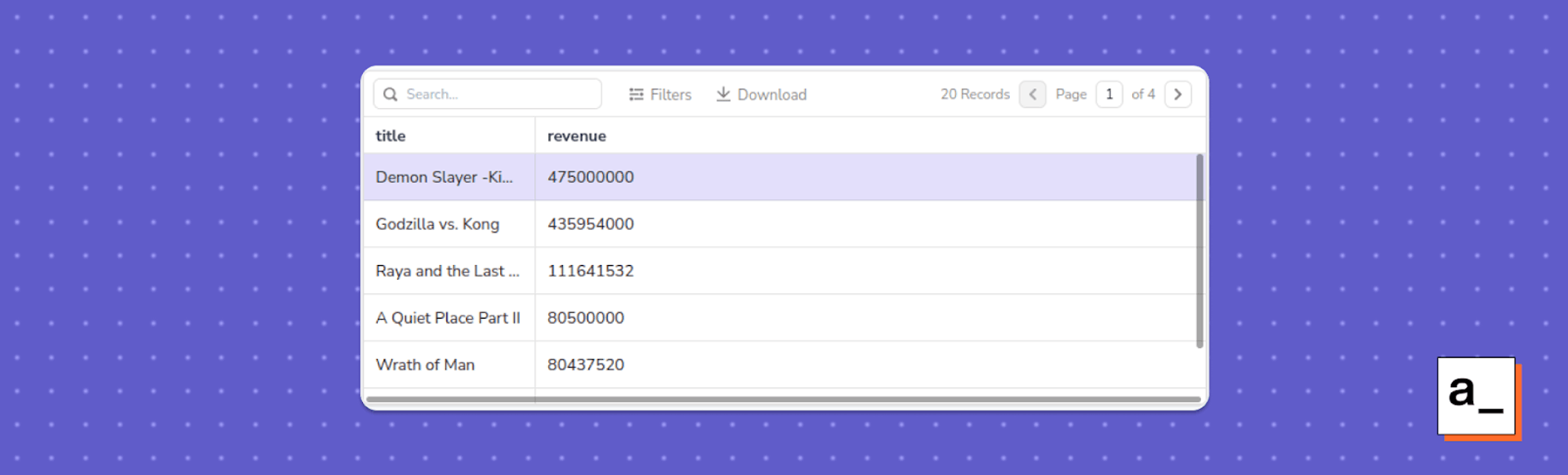
Once this query is working, you can display the output using a Table widget. This widget will automatically understand the format of your query so you don't need to add any data mapping like the previous visualizations.
After that, the table should look something like this:
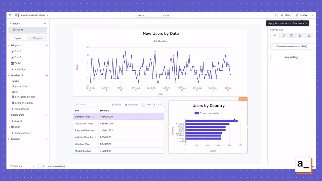
You’re done! Deploy your app!
Once you’ve adjusted the widgets on the canvas to look how you want, you can deploy your fully-functional application by clicking the Deploy button in the top right.
This dashboard is fully interactive and you can always add more databases, queries, and widgets to display whatever data you want in one convenient location. If you haven’t yet done so, this is also a good time to connect Appsmith to Git, so that you can roll back if you’ve made a mistake, collaborate with others, and back up your code.
What used to take you hours can now take minutes
Building a dashboard like this would usually be considered a complex and time-consuming task for any developer. You would need to spin up your own development and production servers, write your own logic to connect to the back-end database, write your queries, build your own front-end UI widgets, and write your own front-end event handlers. Lots of time, lots of effort, lots of places for something to go wrong.
With an app platform, everything can be done with just a few button clicks by heavily leveraging automation, while still providing all of the versatility found in any other IDE. This is a powerful idea, so if you want to try it out for yourself, sign up for the free cloud-hosted version of Appsmith and start building your own database visualizations.