Introducing Intent-based Auto-layouts in Appsmith

We have been heads-down on making it as easy to build responsive apps on Appsmith as desktop web ones and we are happy to announce the general availability of intent-based auto-layouts, a first-of-its-kind feature for responsive app building. This early version of intent-based auto-layouts is our first in a series of features designed to help developers build responsive apps much faster than our erstwhile approaches to fixed positioning layouts allow.
Before we unpack how fast and easy intent-based auto-layouts make responsive app building, let’s see how we got here.
Fixed positioning sucks for responsive app building
Responsive app building, especially for the mobile web, is typically disconnected from desktop app building. Of the considerations involved in the build, responsiveness and usability probably rank the highest, but arriving at usable mobile layouts without detracting the app from its desktop mode is iterative and time-taking.
To make internal app building fast and less iterative, most app builder tools unify building desktop and mobile web apps by baking responsiveness into one interface. As with most drag-and-drop tech, this responsiveness in app builder tools relies on something called fixed positioning layouts, which as you will see below, causes more problems than it solves. Two popular approaches exist, both with their own sets of cons.
The first is absolute positioning—think Appsmith until today. While easy to get started, you soon see yourself spending cycles on positioning UI elements to spec.
The second is real-time reflow which lets UI elements position themselves to existing ones on the canvas. Still, you spend too much time in resizing them, as you have in Appsmith.
A slightly better approach to this is reflow that positions elements after they are dropped on the canvas. Better because unlike real-time reflow, it doesn't mess up your existing UI elements. Think Retool.
Sure, it’s better than real-time reflows, but you still have to handle micro-edits to positions and sizes manually.
Auto-layouts to the rescue?
Because the idea of real-time positions on a fixed layout is flawed at its core, a fundamentally better approach is what generally powers web apps built outside of most app builders—auto-layouts. Reordering fields in simple forms, swapping component positions in your app, or even handling white space for a deleted widget are easy and you don’t grapple with UI controls.
This saves time initially, but getting the exact layout you want is counter-intuitive to the popular mental model of dragging an element to position it. For example, you cannot just move a button to make it the right-most. Frustrating!
Wanted: A paradigm shift for app builders
Recapping your options, you could
Go with fluid width mode and hope it works well enough on the end-user’s phone: The interface will likely become unusable before reaching mobile screen dimensions.
Build for mobile and use on desktops: That means letting go of precious real-estate on desktop screens.
Maintain two copies of the app, one for desktops and another for mobiles: If you could get behind building and maintaining two apps doing the exact same thing, you wouldn’t be reading this.
Ignore the mobile market: And return to the cave, hunt, and cook raw meet on fire
Delivering on the promise of fast + easy app building must cover apps that run equally well, look equally good, and be equally easy to use everywhere—a smartphone, a tablet, even a desktop with ultra-wide display—without the overhead of maintaining two different copies or alternatively, looking uncannily like a fine-brush-stroke artist.
Build once, run everywhere
Our latest approach combines the intuitiveness of absolute positioning and the power of auto-layouts. We are calling this game-changer intent-based auto-layouts and it is available on Appsmith for all our users today.
Now, all you have to do is move the widget where it should be and Appsmith handles positioning and size so you can create neat and tidy layouts much faster.
Fixed positioning layouts | Auto-layouts | Intent-based layouts |
|---|---|---|
Natural Mental model is simple | Handles position automatically | Extends absolute positioning’s mental model with auto-layouts ease of use |
Doesn’t work for responsive app builds | Works well for responsive app builds | Responsive by default |
Sucks for anything more complex than simple admin panels and dashboards | Sucks for complex apps with nested elements within containers | Works very well for complex apps with several nested UI elements |
📚 Why intent-based? |
Appsmith interprets your intent when you drop a widget anywhere in your layout and makes sure the widget is properly positioned and sized. |
Built for simple apps
Before today, having two input fields in a simple form meant enforced understanding of reflows so you could place one field next to the other. Then, you would size one or the other or both to make them look nice.
Now, Appsmith just automatically handles the position and size of both fields when you drop one next to another. It does this with smart math for the container’s size and what would look nice and tidy inside.
Built for complex apps
Reordering widget blocks with nested elements used to be tricky. Fun times.
Now, you just move them and Appsmith understands you intend to reorder them. Magic!
Built for everything else
Like buttons. We know, right?
Dragging buttons to align them on a fixed-positioning layout is natural.
Auto-layouts are not very much better either. You have to reconfigure multiple containers to achieve the same look.
Appsmith acts on your intent—align to the left, group to the left, put in the middle, askew—without trading off the natural intuitiveness of dragging.
We believe intent-based layouts is going to double your speed of building web + responsive apps in Appsmith and usher in a new approach to responsiveness that will become the de-facto standard for all app builder tools. We are proud to lead the charge by example and welcome your candid feedback.
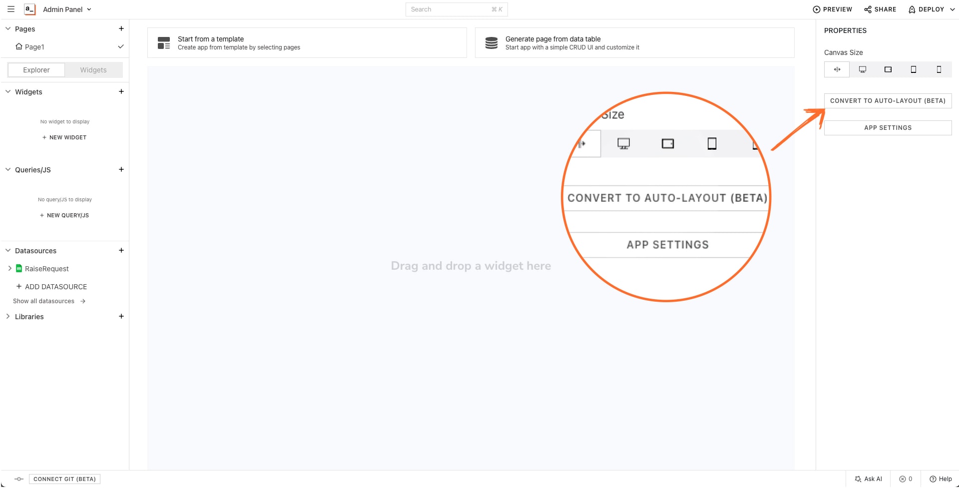
To try it for existing or new apps, find Convert To Auto-layout in the right pane when you edit an app and follow the built-in wizard.
Call-outs
Intent-based layouts are opt-in right now so you can dip your toes in and see how well it works for you.
Before we release the next update, you can switch between fixed and intent-based layouts any time.
Snapshots of your existing layouts will safeguard your apps for five days. Should intent-based layouts not work for you, you can revert to your previous layouts within those five days.
What’s next
Intent-based auto-layouts are a new paradigm to building apps but they are just the first in a long line of improvements toward making universal apps the default in Appsmith. Here’s what’s slated for this year.
App-level layouts: We will offer presets for changing layouts from desktop to mobile and everything in between.
Container and cell splitting: We will make it super-easy to get responsive dual-container and -column layouts for simpler apps.
Intent-based widget resizing: We will soon make widgets match intent-based auto-layouts in their responsiveness and smarts.
Improving the drag-and-drop experience: Make it more seamless and intuitive
Related Blog Posts

